
Here’s another one that popped up from someone looking for Power BI support at Tapestries Group. I’ve also run into this at Dynamics User Group a number of times, so here’s a couple of approaches
The problem – a delimited column with multiple values
Let’s say you have this data:
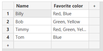
You want to filter for all people who have green as one of their favorite colors. It obviously won’t work to just add the “favorite color” as a slicer, since “Green, Yellow” and “Red, Green, Yellow” are both distinct and treated as a standalone string.
How to fix this using Power Query
We’ll have to split each of these fields into separate columns, pivot them, and then use the result as a filter.
- Open Power Query
- Right click the “Favorite color” column and click “split column by delimiter”
- Choose “comma” for the delimiter (or whatever your delimiter is)
- Make sure the “Split at” field has “each occurrence of the delimiter” selected
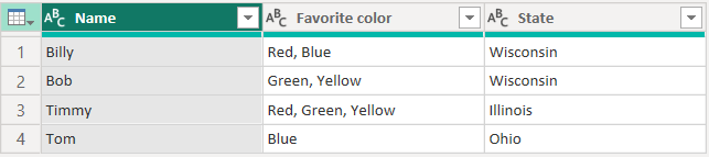
- Select the resultant columns (in my case, they were called “Favorite color.1”, “Favorite color.2”, and “Favorite color.3”) and click “Transform”->” Unpivot columns”
- After this step, you should get a table that has multiple rows of the name and then a key-value pair with the column names in the “Attribute” column and the colors listed separate in the “Value” column
- Right click on the “Attribute” column and click “Remove columns”
- Select the “Value” column, and click “Transform”->”Format”->”Trim”
- Click “Close & Apply”
Bonus tip – turn this into a dimension table
In most cases, I imagine you’ll be using this approach on a table with more than two columns. If you want to be able to filter that table on the tags, keep the original column and build a relationship between the two
- Duplicate your query and rename them to make more sense
- Delete the steps that we previously did in the original approach (I named mine “data” and “favorite colors”)
- Clean up the columns in both tables to make sure the data is all transformed appropriately
- Create a relationship between the “data” and “favorite colors” table based on name
- Add the “favorite colors” table to your visualization as a slicer
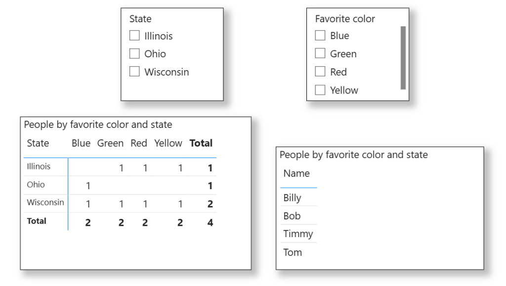
I know this dataset stinks, but I think you get the idea.
Final thoughts
Sometimes it’s a lot easier to use a choice with multi-select field in Dynamics 365 or whatever other data set you’re using, but it’s easier for reporting to split them out. If it doesn’t make sense to do that in the UI, Power Query makes it easy to still report on this data.
Leave a Reply