

Overview
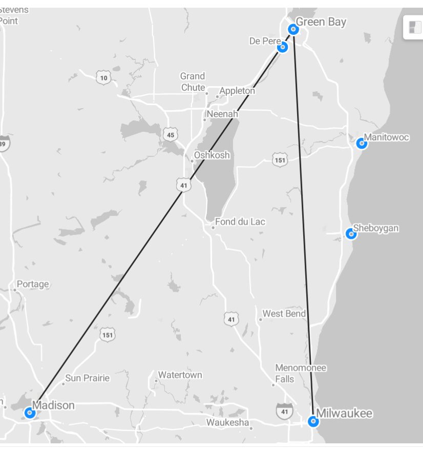
Had someone reach out to my Tapestries Group asking how to use Azure the paths feature of Azure Maps. Their specific request was to have a map that had both paths and points layered on top of each other.

How to build the data
This was pretty straightforward to do. The data set for a map like this needs to look something like the the following:

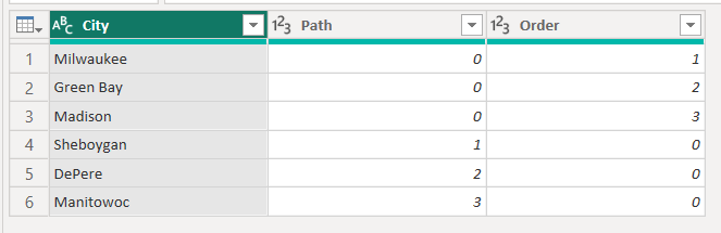
You can probably infer what’s happening from the screenshot. In a case where the Path ID is the same, the Azure maps visualization will draw a path between the points. In the case where there’s not more than one record using the same Path ID, it keeps the individual locations as just points with no path.
How to set up the visualization
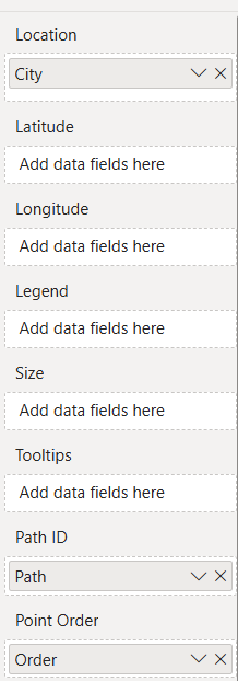
As a quick refresher, this is what the data visualization settings look like to get this map to display:

Every day I learn something new. If you want this kind of Power BI support, hit me up at Tapestries Group.
Leave a Reply Cancel reply