
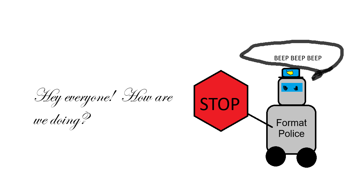
When I write documentation, I try my best to make sure the voice, format, and look are consistent across things I write. One of the things that I find hardest about delegating is being able to share my focus on consistency. In reality, the subject matter and content are the important things for someone doing a task to get right, but formatting and brand consistency issues drive me nuts.
As I start a new Claude Cowork project, I like to make sure it has a brand guideline in its context. Sometimes, I have one already (or tell it to build one based on an existing document or website), but sometimes I don’t.
In this example, I’m asking Claude Cowork to build me a brand guide for Northwind Kitchenware Co. I’ll tell Claude Cowork to use this every time it generates a new document for me.
The Initial Prompt
i need a branding guide for northwind kitchenware co.  look at the fictional-company-profile document and use that as your company background.

i'll be building customer facing documents (like sales order, sales quotations, solution design documentation) and internal documents.  i'll also need to eventually write memos, emails, and other forms of communication.  keep all this in mind when writing the brand guide
The “Generic AI” Problem
The thing is, Claude Cowork isn’t particularly creative when it comes to coming up with unique color schemes or fonts or design concepts. You’ve probably run across this when seeing the same purple and black color scheme every time you open some new companies’ webpage (looking at you, Tapestries)
Anthropic put together a nice little “cookbook” with some tips and tricks for doing various things. One of the things it wrote was “Prompting for frontend aesthetics“. Here’s the summary:
Claude has strong design capabilities but defaults to safe, generic choices. The techniques in this guide – targeting specific design dimensions, referencing concrete inspirations, and explicitly avoiding common defaults – reliably produce more distinctive output. The full aesthetics prompt works well as a baseline. For more control, use isolated prompts to focus on individual aspects or lock in specific themes across multiple generations.
Clearly.
A Better Prompt
Anyways, I took the little prompt snippet it provided and pasted that into my prompt as well. Here’s the full prompt:
i need a branding guide for northwind kitchenware co.  look at the fictional-company-profile document and use that as your company background.

i'll be building customer facing documents (like sales order, sales quotations, solution design documentation) and internal documents.  i'll also need to eventually write memos, emails, and other forms of communication.  keep all this in mind when writing the brand guide.


<frontend_aesthetics>
You tend to converge toward generic, "on distribution" outputs. In frontend design, this creates what users call the "AI slop" aesthetic. Avoid this: make creative, distinctive frontends that surprise and delight. Focus on:

Typography: Choose fonts that are beautiful, unique, and interesting. Avoid generic fonts like Arial and Inter; opt instead for distinctive choices that elevate the frontend's aesthetics.

Color & Theme: Commit to a cohesive aesthetic. Use CSS variables for consistency. Dominant colors with sharp accents outperform timid, evenly-distributed palettes. Draw from IDE themes and cultural aesthetics for inspiration.

Motion: Use animations for effects and micro-interactions. Prioritize CSS-only solutions for HTML. Use Motion library for React when available. Focus on high-impact moments: one well-orchestrated page load with staggered reveals (animation-delay) creates more delight than scattered micro-interactions.

Backgrounds: Create atmosphere and depth rather than defaulting to solid colors. Layer CSS gradients, use geometric patterns, or add contextual effects that match the overall aesthetic.

Avoid generic AI-generated aesthetics:
- Overused font families (Inter, Roboto, Arial, system fonts)
- Clichéd color schemes (particularly purple gradients on white backgrounds)
- Predictable layouts and component patterns
- Cookie-cutter design that lacks context-specific character

Interpret creatively and make unexpected choices that feel genuinely designed for the context. Vary between light and dark themes, different fonts, different aesthetics. You still tend to converge on common choices (Space Grotesk, for example) across generations. Avoid this: it is critical that you think outside the box!
</frontend_aesthetics>
The Result
It generated an HTML file (I also asked it to generate this as an .md so it’s easier for Claude Cowork to read) and I’ve attached it if you’d like to look at it.
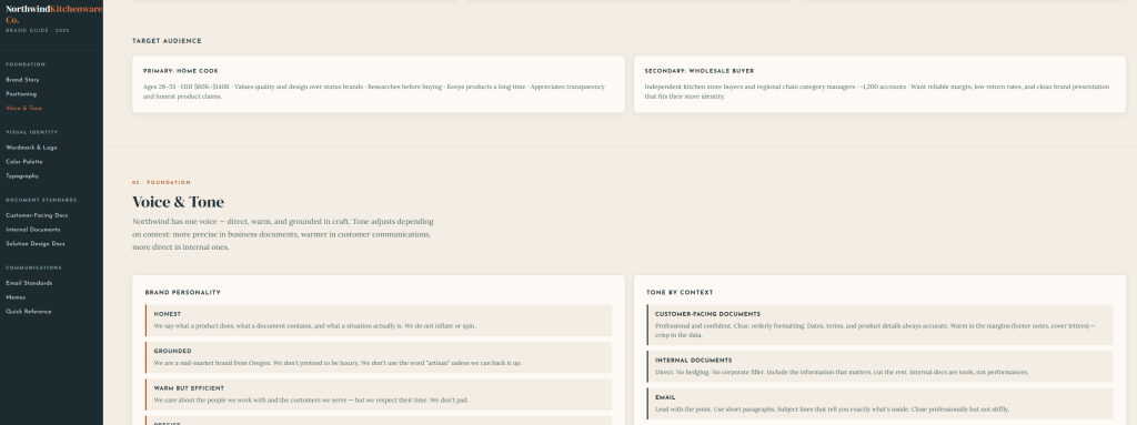
Now that the brand guide lives in the project context, I shouldn’t have to think about it anymore. Every document Claude Cowork creates will pull from it. Ideally, I won’t have to worry about correcting fonts and paragraphs and stuff, and I can instead focus more on the content.